Portfolio
Ashley's
1.
I embarked on a creative journey as a graphic designer to craft a compelling pitch for CAAS (Civil Aviation Authority of Singapore). The project revolved around the design of a captivating poster, meticulously crafted using the versatile Adobe Photoshop toolset.
I aimed to evoke a sense of trust and reliability in the CAAS brand. The poster sought to communicate their commitment to excellence and safety, catering to a diverse audience.

2.
Five to six years ago, I found myself adrift in life after abandoning my internship in the hospitality industry at a 5-star hotel in Singapore. Armed with a Canon EOS 1800D camera and its kit lens, I embarked on a solo journey to Dalat, a city nestled in the Central Highlands of Vietnam. Dalat, with its year-round cool climate and French colonial charm, proved to be the perfect place for soul-searching and healing.
During my visit to the Central Highlands Scientific Research Institute, I encountered a mysterious girl – a complete stranger. However, I was captivated by her unique outfit, and I mustered the courage to ask for permission to capture her image through my lens. Upon returning home and connecting on Facebook, I discovered that she was a freelance model. It was close to Halloween, and she was dressed in a striking red long dress. I decided to edit the photo with a vintage touch, as the location was Dalat and the setting was the Central Highlands Scientific Research Institute, a place steeped in history and nostalgia.
Her gaze in the photo left a profound impression on me. It ignited a spark within me, reigniting my passion for my artistic pursuits. Those eyes inspired me to relentlessly pursue my career aspirations, propelling me further down my artistic path.


3.
In 2019, I embarked on an online digital drawing course, a significant milestone in my journey as a graphic designer. This course provided me with invaluable insights and skills in the realm of digital illustration. One of the standout projects during this learning experience was my attempt at creating a digital sculpture.
Exploring the digital medium opened up a world of possibilities, allowing me to push the boundaries of my artistic capabilities. This particular project challenged me to translate my ideas into a three-dimensional digital form, emphasizing form, texture, and lighting.
Overall, this course not only expanded my skill set as a graphic designer but also ignited my passion for digital art and illustration. It marked a pivotal moment in my career, influencing my approach to design and fueling my creative journey.

The EX COFFEE project involving Lunar New Year stickers for the Year of the Tiger was a delightful endeavor in the realm of graphic design. Tasked with creating endearing and meaningful expressions for this Vietnamese coffee chain, we set out to craft stickers that would evoke warm feelings and spread cheer during the Chinese New Year celebrations.
The color palette chosen was inspired by the traditional red and gold associated with Lunar New Year festivities, ensuring that the stickers seamlessly integrated into the holiday theme. The messages ranged from well-wishes for prosperity and good fortune to playful and endearing phrases that captured the spirit of the Year of the Tiger.
4.

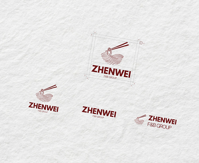
The ZhenWei branding identity project was a thrilling journey into the culinary world of Singapore. As a graphic designer, I was tasked with creating a visual identity that would resonate with the essence of Asian cuisine, particularly the rich noodle culture prevalent in Singapore and across the Asian region. The client's request to incorporate the color red and symbols associated with Asian culture posed an exciting challenge.
Drawing upon the vibrant and diverse culinary traditions, I meticulously crafted a logo using Illustrator. The centerpiece of the logo featured a stylized depiction of a steaming bowl of noodles being lifted by chopsticks – a quintessential image that resonated with the heart of Asian gastronomy. The use of red, a color symbolizing good fortune and prosperity in many Asian cultures, was strategically implemented throughout the branding materials to create a sense of warmth and authenticity.
In addition to the logo, I designed various collateral materials, such as menus, signage, and packaging, all carrying the same thematic elements. The goal was to immerse customers in an authentic Asian dining experience from the moment they encountered ZhenWei's branding.
5.
It was a tremendous honor to be entrusted with the opportunity to contribute my skills as a graphic designer to the Kim Hua Guan brand in Singapore. Collaborating on the design of their social media posts allowed me to immerse myself in the rich tapestry of this esteemed heritage brand.
Kim Hua Guan's storied history and commitment to quality provided me with ample inspiration. My goal was to capture the essence of their tradition while infusing a contemporary and engaging visual language. Each social media post became a canvas for storytelling, combining elements of nostalgia with modern aesthetics.
With meticulous attention to detail and a deep appreciation for the brand's legacy, I crafted visuals that resonated with Kim Hua Guan's audience. From showcasing their exquisite products to sharing the brand's values and heritage, every post was a labor of love and a testament to the artistry of graphic design.
6.

It was a privilege and a delight to be part of the Bed Affairs project as a graphic designer. Working on the creation of social media posts and product banners for their website was an opportunity to showcase the elegance and comfort that the brand exudes.
Every design element, from color choices to typography and imagery selection, was meticulously considered to align with Bed Affairs' identity. The creative process allowed me to translate the brand's values into compelling visuals that not only showcased their products but also resonated with their target audience.
7.

It was a tremendous honor to be entrusted with the Kim Hua Guan website project as a UI/UX designer. The challenge was to create a digital space that reflected the brand's rich heritage and tradition, while also providing a user-friendly and visually appealing experience.
Staying true to Kim Hua Guan's classic and timeless identity, I opted for a clean and traditional layout. Simplicity was key, allowing the brand's legacy to shine through. Every design decision, from font selection to color choices, adhered closely to the established brand identity, ensuring a seamless and cohesive representation.
Leveraging the powerful design capabilities of Figma, I meticulously crafted each page, paying attention to every detail to ensure a harmonious user experience. The result was a website that not only showcased Kim Hua Guan's products and heritage but also served as a testament to the enduring beauty of tradition in the digital age.
8.


Participating in the Siglo website design project was a true privilege for me as a UI/UX designer. The task at hand was to create a digital space that conveyed a sense of warmth and familial comfort, aligning with Siglo's values and identity.
To achieve this, I seamlessly incorporated Siglo's brand colors, infusing the website with their distinctive palette to create a visual connection to their identity. Additionally, I opted for a font with serifs, adding a touch of sophistication and refinement to the overall design, reinforcing the brand's commitment to quality.
The focus on shapes and elements resembling doorways and house structures was pivotal in achieving a sense of closeness and familiarity. These design choices evoked the feeling of home, making visitors to the website feel like they were stepping into a welcoming and cozy environment.
9.
Drawing inspiration from Kampong House's rich heritage, I meticulously crafted social media visuals that paid homage to its values and essence. Each post was thoughtfully designed to resonate with the brand's identity while also engaging and informing its online audience.
I embraced the challenge of creating a visual narrative that encapsulated Kampong House's warmth, authenticity, and cultural significance. My goal was to transport viewers into the heart of a traditional Kampong village through every social media post.
Being part of the Kampong House project allowed me to blend creativity with cultural appreciation, and I take pride in contributing to a brand that values its roots. It reaffirmed the profound impact that graphic design can have in conveying a brand's identity and connecting with its audience in the digital realm.
10.


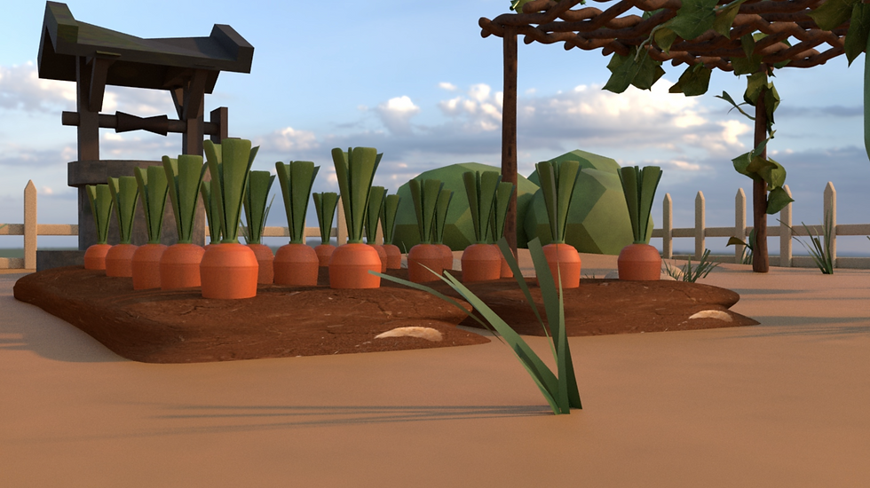
In the final semester of my education at Arena, I had the privilege of delving into the world of 3D design, which marked a significant milestone in my journey as a graphic designer. This course was not just about learning software; it was about crafting immersive visual narratives.
One of the most captivating aspects of this experience was creating 3D scenes for an animated film. I had the opportunity to breathe life into a digital landscape, focusing on the intricate details of a farm and a rustic farmhouse. This involved meticulous attention to every element, from the textures of the soil to the play of light and shadow on the quaint architecture.
This venture into 3D design allowed me to combine technical skills with artistic creativity, emphasizing the importance of storytelling through visuals. It was a transformative experience that ignited my passion for 3D graphics and animation, leaving an indelible mark on my career as a graphic designer.